Social content, premium collateral, and campaign video that brought a household tire brand into feed worthy territory.
Refreshing Discount Tire for a new generation of buyers
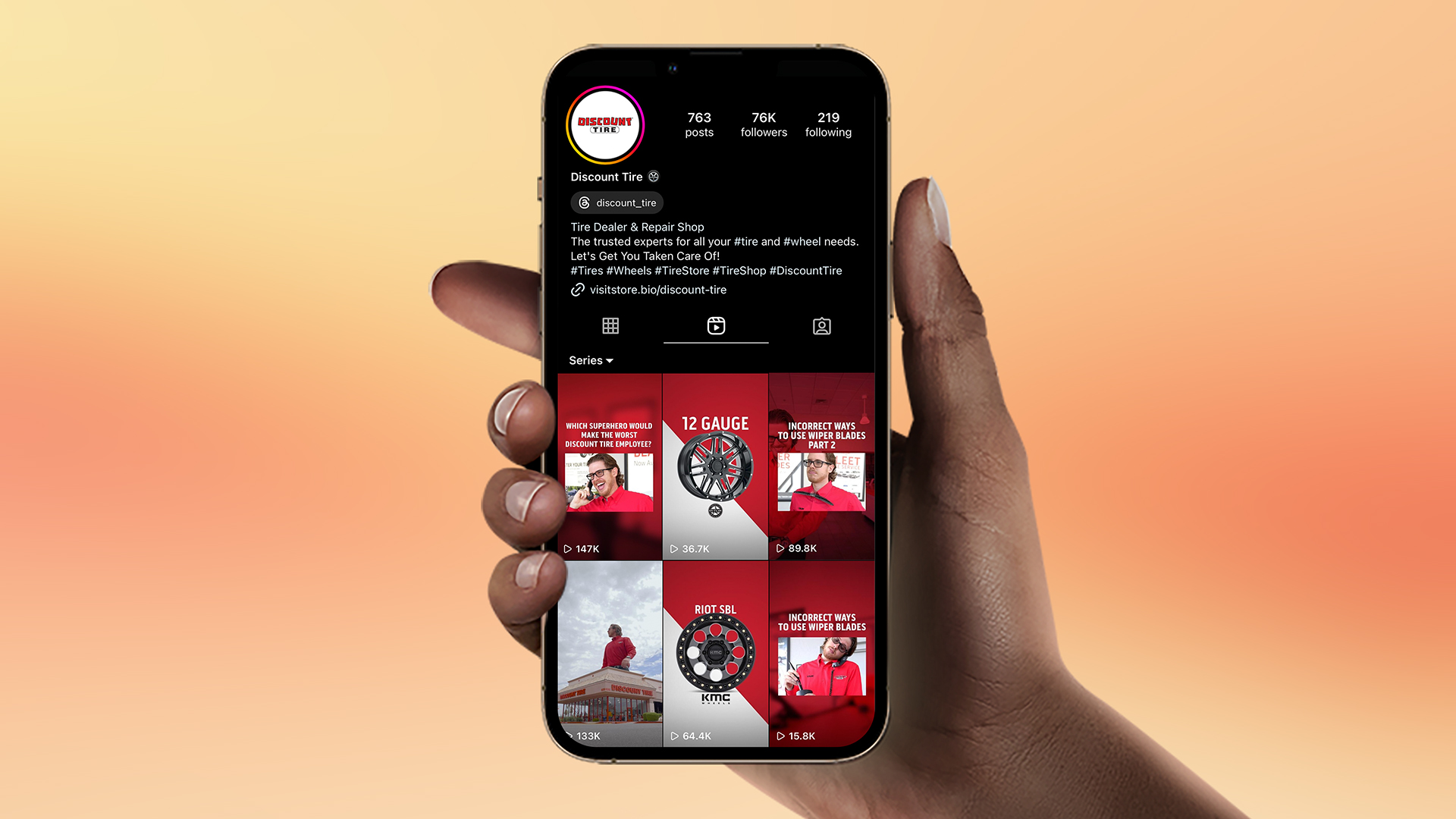
Discount Tire is a household name — the kind of brand people know without thinking. The problem was that the same utility that built the business made it easy to scroll past on feed. A younger audience was choosing brands that looked like culture, not like errands, and Discount Tire wanted its look to keep up. The work had to stay familiar enough for its existing customer and fresh enough to earn a follow from everyone else.
THE DIRECTION
The direction was to stop designing Discount Tire like a service menu and start designing it like a brand with a point of view.
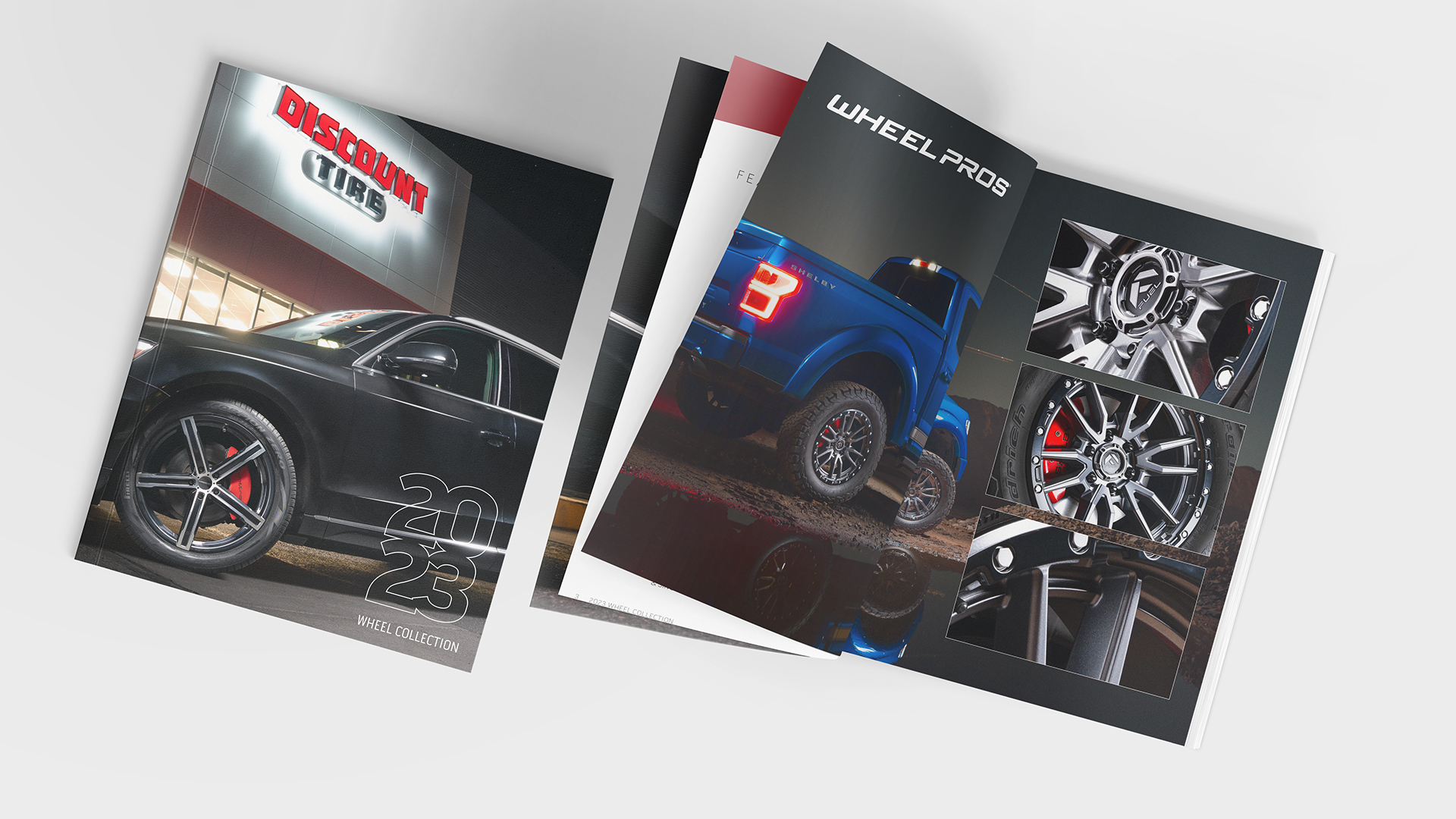

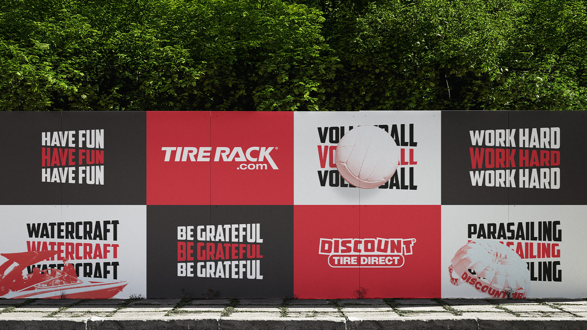
I set a creative standard that ran across every surface: product as hero, type doing the heavy lifting, and leaning into the bold Discount Tire color palette. Fresh creative spread between engaging content creation for social that increased engagement and reach to print assets that felt premium with a velvet touch like the wheel catalog and annual report.

THE REACH
The refresh traveled further than its original scope. Other departments pulled the visual system into their own work, social engagement increased, and the brand started showing up the same way across every surface instead of a different way on each one. What started as a social refresh turned into a broader reset — a brand that had been coasting on recognition gave its next generation of customers a reason to look twice, without costing it the ones who already knew the name.